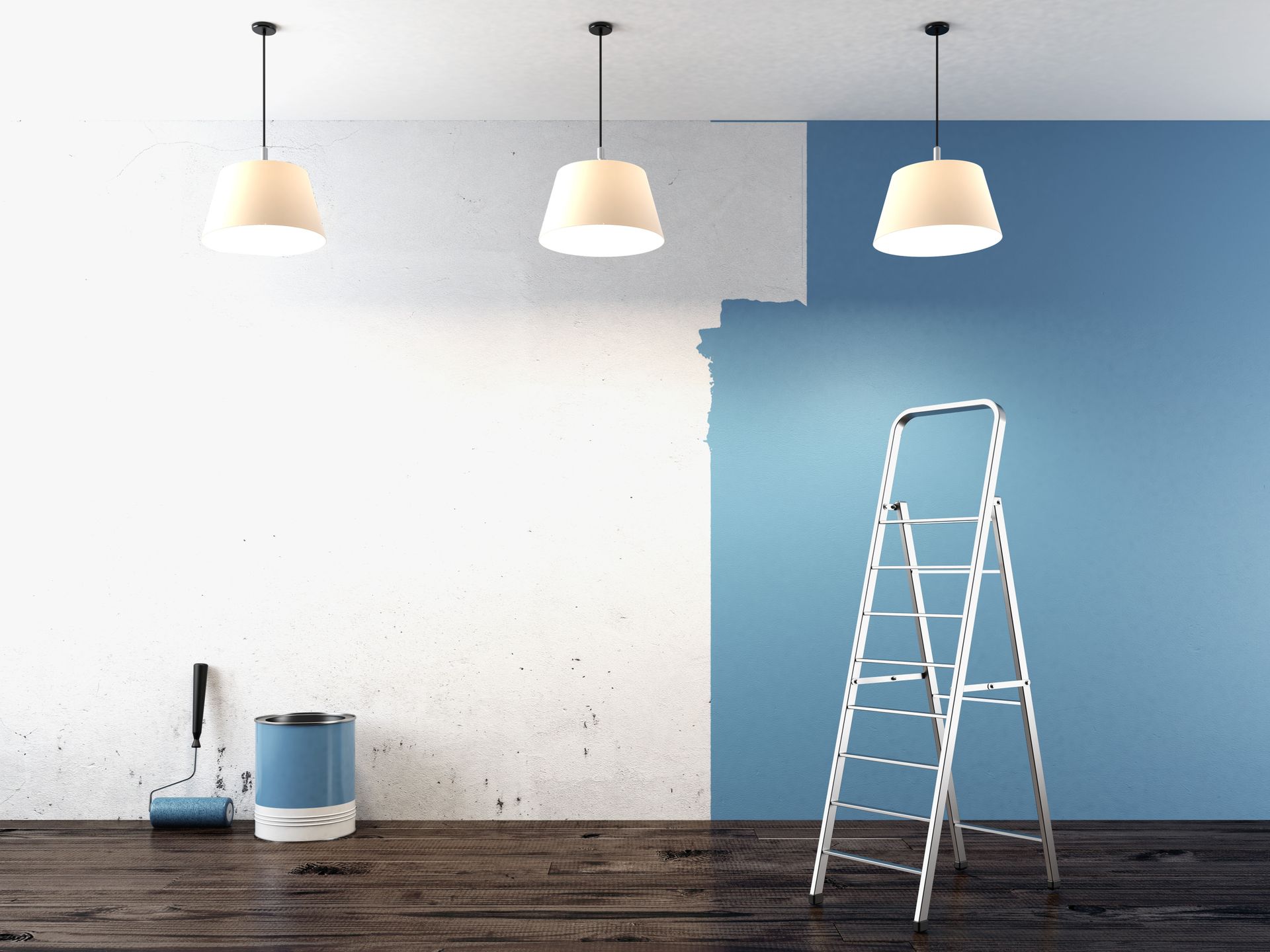
April 28, 2026
When you walk into a room, your brain immediately processes the dimensions and the atmosphere before you even consciously notice the color of the walls. However, that split-second perception is almost entirely dictated by the way light interacts with the pigments on those surfaces. For homeowners in Cincinnati and Northern Kentucky, choosing a color isn't just about matching a sofa or following a trend; it's about architectural manipulation through chemistry and light. Hiring a professional painting company is often the first step in solving spatial puzzles, as the right hue can make a cramped guest room feel like a breezy suite or turn a cold, cavernous living area into a cozy retreat. Understanding the science behind light reflectance and visual weight helps you make informed decisions that transform your living experience.
The way we perceive space is deeply tied to the volume of light bouncing around a room. Light Reflectance Value, or LRV, is a scale used by design professionals to measure the percentage of light a paint color reflects. A high LRV means the color reflects most of the light, while a low LRV means the color absorbs it. When you work with a skilled painting company, they can help you navigate these numbers to ensure your basement doesn't feel like a cave. It’s fascinating to consider the scale of this trade across the country. According to Workyard, the painting sector in the U.S. currently supports a workforce of more than 300,000 individuals, and a significant portion of their expertise involves managing how these values change based on a home’s specific orientation to the sun.
Evaluating the Impact of Natural Light
The direction your windows face is the most critical factor in how a paint color will behave throughout the day. North-facing rooms tend to receive a cool, bluish light that can make even the most beautiful gray look chilly or clinical. To counteract this, an experienced painting company will often suggest warm-toned neutrals with yellow or peach undertones to bring a sense of artificial sunshine into the space. Conversely, south-facing rooms are flooded with intense, warm light that can wash out pale colors or make vibrant oranges feel overwhelming. In these bright spaces, you have the freedom to use cooler tones like seafoam green or soft lavender, which will be balanced by the natural warmth of the sun, creating a serene and perfectly leveled environment.
Manipulating the Perception of Square Footage
Color doesn't just change the mood; it physically alters where your eyes think the walls are located. Light colors are recessive, meaning they seem to move away from the viewer, which effectively pushes the walls outward and makes a small room feel significantly larger. If you have a tiny home office or a narrow hallway, a painting company might recommend a crisp white or a very pale blue to maximize the "airiness" of the area. On the other hand, dark colors are advancing. They move toward the viewer, which can be used to your advantage in a room that feels too large or impersonal. By painting a far wall in a deep charcoal or navy, you bring that wall closer, creating a focal point that grounds the room and makes it feel more intimate.
Coordinating the Relationship Between Finishes
The sheen of the paint you choose is just as important as the color itself when it comes to lighting. A flat or matte finish absorbs light, which hides imperfections in the drywall but can make a room feel a bit more enclosed and static. Satin or eggshell finishes provide a slight glow that helps bounce light around without creating harsh glares. When a painting company applies a high-gloss finish to a ceiling, it creates a mirror-like effect that can make low ceilings feel much higher than they actually are. This interplay between color and texture is a subtle art form. By mixing different sheens of the same color on the walls and the trim, you can create a sophisticated, monochromatic look that adds depth and architectural interest without cluttering the visual field with too many different pigments.
Utilizing the Power of Accent Walls
If you aren't ready to commit to a full room of a dramatic color, the strategic placement of an accent wall can serve as a powerful tool for resizing a room. For instance, in a long, narrow room, painting the two shorter end walls a darker shade while keeping the long side walls light will help "square off" the space. This visual trick prevents the "bowling alley" effect that many homeowners struggle with in older layouts. A professional painting company knows that the eye is naturally drawn to the darkest or brightest point in a room. By placing that point of interest on a specific wall, you can direct traffic, highlight a beautiful fireplace, or even distract from a less desirable architectural feature, all while maintaining a sense of balanced proportions.
Analyzing the Role of Artificial Lighting
The transformation doesn't stop when the sun goes down, as artificial lighting can completely shift the way your paint looks at night. Incandescent and warm LED bulbs enhance reds and yellows but can dull blues and greens, while "daylight" bulbs can make warm colors look slightly muddy. Before your painting company begins the first coat, it’s vital to test samples under the specific light fixtures you plan to use. A color that looks like a perfect tan in the showroom might turn into a strange olive green under your kitchen's fluorescent lights. By viewing large swatches at different times of the day and night, you ensure that the spatial perception you've worked so hard to create remains consistent regardless of the light source.
Designing the Flow of Connected Spaces
In modern open-concept homes, the transition between rooms is where the impact of paint is most visible. Using a consistent color palette throughout the main living areas allows the eye to travel uninterrupted, which creates a sense of endless space. If you change colors abruptly at every doorway, you break the visual flow and make the house feel like a series of small, disconnected boxes. A savvy painting company will often suggest using "sister colors" to provide subtle definition between the dining area and the living room without creating harsh borders. This cohesive approach ensures that your home feels like a singular, expansive environment rather than a collection of cramped quarters.
The journey from a blank canvas to a perfectly balanced room requires a blend of personal taste and scientific application. We've seen how LRV affects brightness, how window orientation dictates tone, and how sheen can add height or hide flaws. It’s a complex process, but the results are worth the effort when you see your home transformed into a place that feels exactly as large or as cozy as you've always imagined. By depending on a professional painting company to handle the technical execution, you ensure that the vision you have in your head translates perfectly onto your walls. Color is the most cost-effective renovation tool available to any homeowner, providing a massive return on investment in both property value and daily comfort. When you're ready to see how the perfect palette can redefine the boundaries of your home, Quality Painters LLC is here to bring your vision to life.